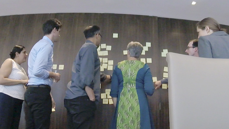
The New Urban Mobility Alliance was formed in 2019 to leverage revolutions in urban transport to change the way cities work—prioritizing the movement of people, not cars. Starting from scratch, I led the key stakeholders on a naming exercise to bring the group together on a decision. From there, I convened a visioning workshop in New York City to align the group on direction, goals, and key elements around the brand.
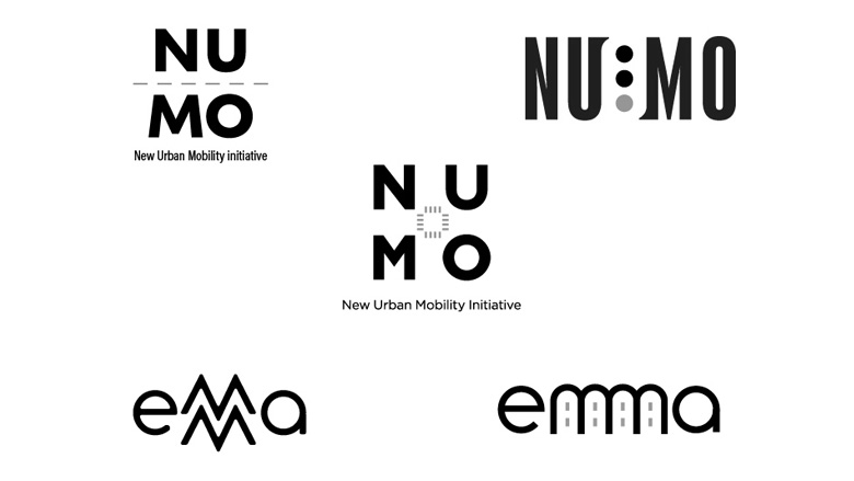
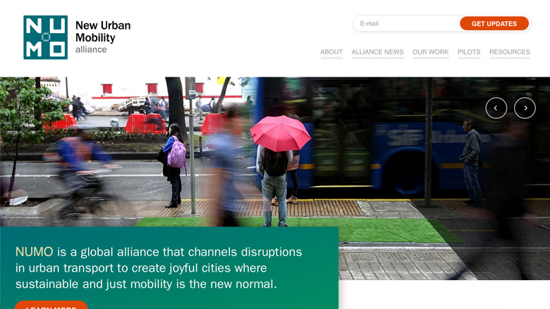
With that research in hand, I developed a number of different visual approaches, and through careful conversations with the group, they immediately picked one and I refined it to the final mark. The concept was that of a city block looking down from above, with a crosswalk at the center of the square, using a typeface with square elements to stand in as buildings. A square, bold mark stands out in a sea of other logos, and I developed a horizontal version for smaller applications. Finally, I developed the color palette and built out a brand book to hand off to the digital team, sourcing photography and visual elements to build out a brand language.